Monday, June 23, 2014

Sweet Sixteen Birthday Card

A Sweet 16 birthday card made for a friend of the family. I had to make two cards, because the first one was given to the birthday girl and as usual, I forgot to take photos of it. So today I made a similar one. This card was a bit difficult for me because I don't use glitter that often and the style is somewhat outside of what I'm drawn to make, but that's how we grow as artists and I think it turned out cute.


Materials
 
 Basic inexpensive glitter in black and pink.
Self adhesive pearls.


 Happy Crafting!
 post signature

Thursday, June 19, 2014

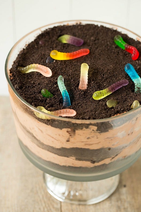
3 Fun Desserts Found on the Web


  I'm not one to share food recipes on my blog, but I appreciate creativity in many forms. My daughter loves to bake and make desserts so I've come to really respect what she does and what she does always produces something very delicious.

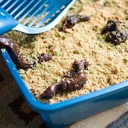
I came across these dessert recipes initially on Facebook. My daughter and I think the first one is perfect for a summer picnic. The next two will be made just for my husband, son, and my daughter's boyfriend for an after dinner dessert. We can't wait to see their reactions.

Sand Pudding
sand pudding
Photo from link
 
 Dirt Dessert
Dirt Dessert Recipe
Photo from link
 
Kitty Litter Cake
Kitty Litter Cake Recipe
Photo from link
  
If you make them and get a reaction, I would love to hear your stories :)
 
post signature

Tuesday, June 17, 2014

The Easiest Way and Best Directions to Make a Blog Button I've Found on the Web

 Hello and welcome to...


Last October I was a newbie to blogging. It was an exciting time and an overwhelming one. I wanted to share my crafts with people, but I didn't even understand what a widget was. In February with more experience and confidence I chose to make my own blog button.

Honestly, I just wanted one because I thought they were cute. The process should have been simple, after all I was seeing cute little blog buttons everywhere, but for whatever reason every time I tried to make one something went wrong. Talk about frustrating! 


In the end I placed my button in a post and gave up. So here I am, eight months into blogging and I finally have a button. I found Lyla Willingham's Blog, The Willingham Enterprise

The How-to provided is excellent and now I have my own blog button. It looks great and more importantly it works!

There are 5 steps provided which I encourage anyone who wants a button to follow.

  1. Design your button
  2. Upload the button
  3. Use this great "Grab My Button" Code Generator
  4. Copy and paste the the code into your blog post or a text widget in your sidebar or footer
  5. Save and preview the page


After you go through the first two steps you'll be at the Code Generator. It didn't take much to figure out, but for a moment after filling it out I sat there looking at it and wondering where the button to get my code was. I could have cared less about "Preview", all I was thinking was, "Where's the button to "Submit". So let me break that down quickly and simply with a few photos.

I may just be more dense than most, so if anyone is in the dense category with me, this is for you.


The parts you want to fill out are circled in red. When your done filling it out, click "Preview".

When you click Preview, this window will pop up. Click "Get Code"


Then you will see the Code Generator again and at the bottom will be the code you need to copy and paste.


That's all there is to it!
So check out the The Willingham Enterprise tutorial and get your own :)
 
Disclaimer: I am in no way affiliated or associated with the link I've directed you to. I just think it's a great tutorial.

Happy Crafting and Blogging!
post signature

Monday, June 16, 2014

Easy Way to Make Your Own Shabby Chic Wall Clock

When I was at local yard sales recently, one of the places allowed people to fill a bag for $5.00. After stuffing some material in my bag to make table skirts for my craft room I had a little more room left for a few more things. One of the items I grabbed was a clock. I needed one for my craft room, but I wasn't quite sure what I'd do to make it more appealing. It wasn't a bad looking clock before, it was just too plain and dark for my room. I like the shabby chic appearance much better and it was really easy to do.


The first thing I did was take it apart.


Next I painted the two circles pink with acrylic paint.

 I wasn't sure what to do with it next, but while looking around for ideas I found crackle medium in my paint cabinet and decided to give it a try. You just brush it on, over your first dry layer of paint, and then let it dry. The crackle medium is clear, but shiny so it wasn't difficult to tell where to paint and where I had already painted it on.

The result is fabulous and it was fun watching it. The crackle effect began happening right away so I continued to paint the white acrylic paint on quickly. There was no need to be super neat about it. I just tried to apply the paint as evenly as possible without having to go over it too much.

Once I finished applying the white paint I let the clock dry completely for a couple of days before touching it. It's not necessary to leave it alone that long, but it should at least be allowed to dry overnight. Waiting is just to be on the safe side of not ruining the finish as you put it back together and embellish it.
Before I put the clock back together I embellished the inside. I placed gems between the numbers, a pink swirl of gems under the twelve and I hot glued a pearl strand onto the inside edge of the clock face.

Once I was done decorating the inside I put the clock back together and hot glued pearl strands (fake pearl necklaces I bought at yard sales) to the outside of the clock.
Then I made a bow with some hanging ribbon and pearl strands. I tied them together with wire and then hot glued the entire thing onto the bottom of my clock as one piece. Once the glue was dry I hot glued a store bought white flower in the middle to cover the wire.

I always try to keep some handmade flowers available for projects and these flowers were perfect for my clock. I made them using lace and ribbon and just weaved a wire in and out, then gathered the material in a circle and twisted the wire ends together. They were very easy flowers to make and you can use anything for the centers of your flowers.


Here is my clock hanging.

My finished clock turned out gorgeous and it feels good when I check the time to be looking at something that I made.

If your interested in making your own flowers check out
Handmade Flowers

Happy Crafting!
 
post signature

Monday, June 9, 2014

Flower and Pearl Tag Journal

I'm getting back to finishing my craft room makeover today, but before I do I want to reshare my Tag Journal that I made. I call it a Tag Journal because the pages are filled with decorative tags that I can pull out and write something on the back of. I had made this in December of last year and only had a couple of not-so-good photos of the outside, so I'm sharing it again with some updated photos.
My journal is for keeping a record of the happy little moments I have throughout the year. I really don't have time for a diary, nor do I print very many photos to make a scrapbook, so this seemed the best solution. I decorated my journal with vinyl wall-border, cream colored cardstock, pearls, and handmade lace, ribbon and paper flowers. I also decided to add a couple of hat pins I made from beads that go beautifully with the colors of my journal.
For the title I decided to go with the word tender because the moments I write down are the ones that touch my heart in some way.   

 
The fun thing about my journal is that I do not make all the tags ahead of time, but instead leave open places on each page and add tags when I feel like making them. This way as I learn new things, acquire new die shapes and make new embellishments, my tags will reflect that and I always have a little project to do if I run out of ideas for the moment. Below are some of the tags I already wrote on and how they look when they're placed inside.
 I also made a box to hold my journal so it doesn't get dusty and dirty. I made it out of chipboard and larger than the journal so it doesn't crush the flowers and as I add tags there is room for the journal to expand. I sat it upright so you can see the details of the top. I covered the top and sides with a transparency so that it can be easily wiped off and the decorative scrapbook paper is protected underneath. The box is embellished with a handmade paper rose and some lace.

 Happy Crafting!
  post signature

Saturday, June 7, 2014

Upload Your New (Made by You) Background Image to Your Blog


I'm done! Yeah! I hope this helps people just starting out or that want a more personalized blog.

This is the third part of a tutorial series

Now that you've prepared your images and have made them into a blog background, it's time to test it out. If you went in order of the blog series you'll still have your blog background open in Picmonkey to finesse.


Steps:
Although this does NOT involve messing with code, I recommend having a test blog. If you would like to know how to make a test blog and make it private, please ask. It's very simple. 

1. Go to your dashboard by clicking on design.


2. Click on "Template" and then click on "Customize"

3. Click on Background


4. On the box that says "Background Image" click on the down arrow. A box will pop up called, Select Background Image. Click on "Upload Image" and then "Browse"


5. When you click "Upload image" your photos will pop up. Choose the background image you made or found on the web.


6. Your image will show in the box and will also show on your blog. If everything looks good, click on "Done".


7. You're almost finished. Don't forget to click "Apply to blog". Now "View blog".

Congratulations on your new blog background!


Copyright © 2014 Angela Conklin - Heartedly Handcrafted
All Rights Reserved

Friday, June 6, 2014

Make Your Own Blog Background

Aloha Folks!
 I'm not any sort of computer person and I'm still learning, but as I learn I thought it would be helpful to share this information with you. I wrote these tutorials for people that are just starting out, so I tried to add as much detail as possible.

Please read through each step before beginning.
 If you don't know how to make your own images or haven't prepared them yet, visit 
Easy Steps to Make Your Own Images for Blog Backgrounds, Headers and Other Projects

You can use anything to decorate your background, including images of crafts you have made, your dog, furniture, flowers, you can add color or a pattern. You name it!

Steps: In a nutshell for those who are familiar

  1. Go to Picmonkey and click on "Design"
  2. Resize your blank canvas. I use 1680x1050 as recommended on the web.
  3. Click on the "Butterfly". Then click on "Your Own" and choose "My computer"
  4. Choose the image you want and click "Open" 
  5. Rotate and size your image as needed 
  6. To make the other side of your blog background the same, duplicate your image and move it into position.
  7. To make the image mirror your other image: highlight your image and then in the box click on the "up and down" arrows.
  8. Save your new image: You'll have to save your image before you can try it out. Don't close Picmonkey and then you can make any adjustments needed. 

2. Resize your blank canvas. I made mine 1680x1050 as recommended on the web. 

3. Click on the "Butterfly". Then click on "Your Own" and choose "My computer"

4. Choose the image you want and click "Open"


5. Rotate and size your image as needed and put it where you want it.

NOTE: I eyeball where I want it. I do not use measurements for this. Instead I use a test blog with the same template and dimensions as my actual blog and upload the image as a background photo. I will show how to apply this to your blog or a test blog in the next tutorial. Even though you will only be uploading a photo and won't have to mess with code, I recommend a test blog for trials.

6. To make the other side of your blog background the same, duplicate your image and move it into position.

To make the other side of your background: Right click to highlight your image if it's not highlighted. Then left click to bring up the options menu. Click on "Duplicate overlay" This will bring up another image the same size and angle that will appear over your original image.

7. To have the image with the design mirrored on the other side, highlight the image and use the arrows.


8. Save your new image: You'll have to save your image before you can try it out.  DO NOT close your image on Picmonkey. Leave it open and then you can make any adjustments needed and save the new version.

For example, your borders may be too close together (below). With your image still open in Picmonkey you can easily and quickly make the adjustment and save over the first one. Adjusting the background is no big deal. To adjust it, all I did was move the two borders out a little. If you are going to add decorations to your background, I would advice placing some kind of border, stripe or object first so you know the limit to where your decorations can be placed. You can also adjust the width of your blog to fit your new border instead of adjusting the decorative background itself. What ever you choose to do, It may take you a few tries at first, but it will get easier with experience.

So here it is. Adjusted and perfect. 

Copyright © 2014 Angela Conklin - Heartedly Handcrafted
All Rights Reserved